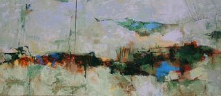
Yes…I have been working,… a LOT for the past couple of days now that I know the color range for my commission. I have no idea if this work will be what the design people have in mind, but I like it so far. There may be some tweaks to be made…simplifications or emphasis made, etc. Since this is an open design, I’ve thought about adding more of the darks in the upper section and running off the top…..but it’s not really necessary. I didn’t want a painting with a horizon and didn’t want to get too much of what I think of as impressionism. This is an abstract painting with a theme of marshland or intercoastal waterways on the gulf of Mexico.
Stay tuned to see if I have to do anything else to it or change it.
After I wrote the above, I tried for a LONG time to upload the picture of the painting and it refused to load. I’ll just try again today……….BUT now things have changed. The designer says, “I thought it would have more dominance of darks”….”I don’t know about those lavender grays”……so I’m printing out a hard copy and having trouble getting it to look fairly right to send. It won’t be received until next week so I think I’ll do a little adjusting in a few places and paint side of canvas (that is a chore) and wait. Printing it out also brought to the fore an idea that it might work better turned upside down as well. Something to think about anyway.
I see the strength of the painting in the darks. To suggest the area better, you might want to increase the amount of dark green, brown and blue. We're talking swamp tours, here… open water, grassy planes and dark cypress. I think you have it in the darks, and the lights are compatible with the locale.
KJ… just thoughts off the top.
Yep…that's what she is wanting….more darks. Only thing I'm scratching my head over is her wondering about the grayed down lavender. She mentioned this to me in my notes….saying " thinking of the silvery lavender tones of a twilight".
Now I'm just fiddling around again waiting until she gets the print out of the painting. It's hard for me to wait since I like "working when the iron is hot" so to speak.
She's being really nice about not telling me how to paint it…..while telling me :>)
In really humid areas, there is sometimes a lavender type glow around dark areas, and areas of shining light on water, and droplets. Almost "Kincadish". I think it would be hard to do in an abstract. I do see the marsh area as being more dark green and blue instead of gray.
Linda
I think you've nailed the colors myself. I stood on my head and looked at it upside down, and they may like it better that way. This will be interesting to watch and see what they think when they see it this week. It's well done, Cheryl.
Pat
Designer said no to the upside down…..will wait for them to see the print out sent snail mail today.
Linda…that lavender polish look is what I was thinking about. Oh well…she thinks the locals won't identify with it but she definately doesn't want it more gray.
Aren't commissions fun when they get into the subtleties of color, after youve painted exactly what they said to begin with?
I did one recently where we went through exactly the same thing. I color-adjusted parts of it with their further instructions, muttering to myself "She wants whaaaaat????" But it all worked out OK.
Yeah…I think it will all work out without too much adjusting. It's just that with acrylic, if you make one adjustment, then that calls for another and you have to then work all over so it will all blend in,etc. There is no such thing as "matching" what went before unless you have a big batch of the paint mixed up either.
This painting is not a light in the lights as the picture looks either..so that's a little misleading to the designer …and she is wanting darker.